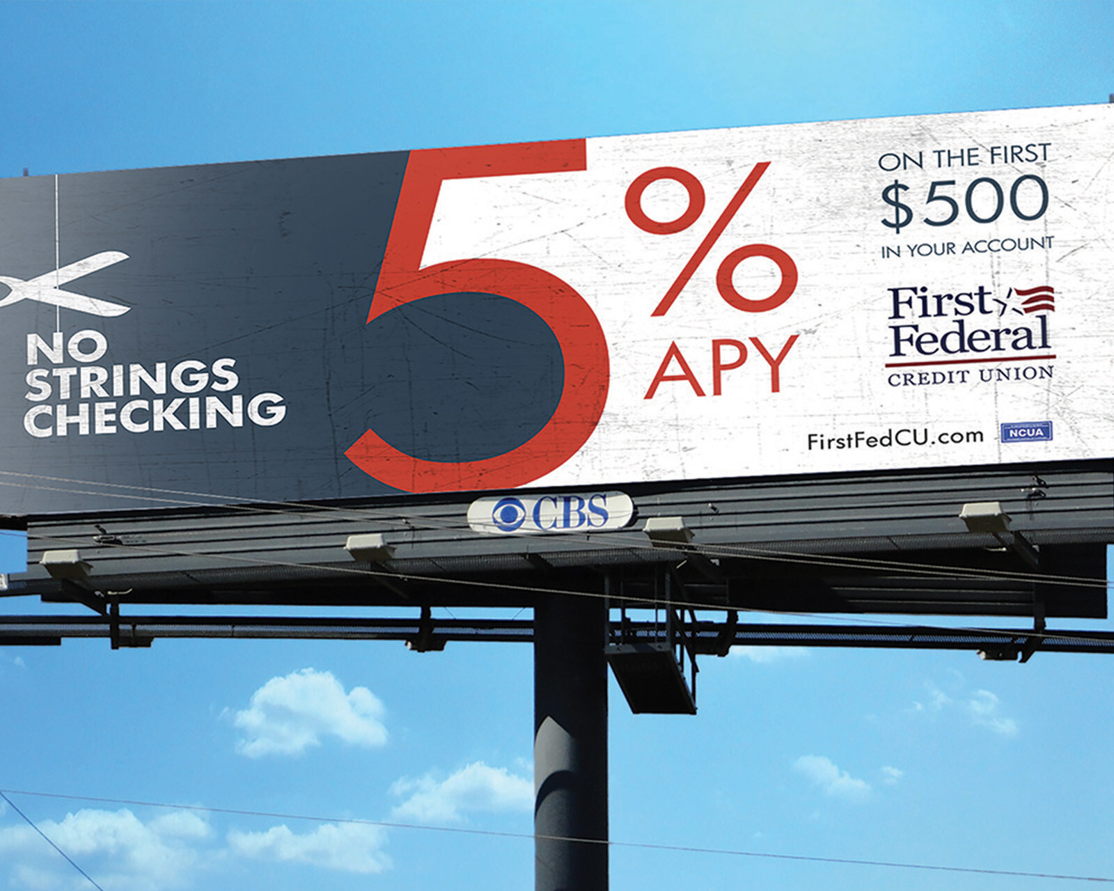
First Federal Credit Union
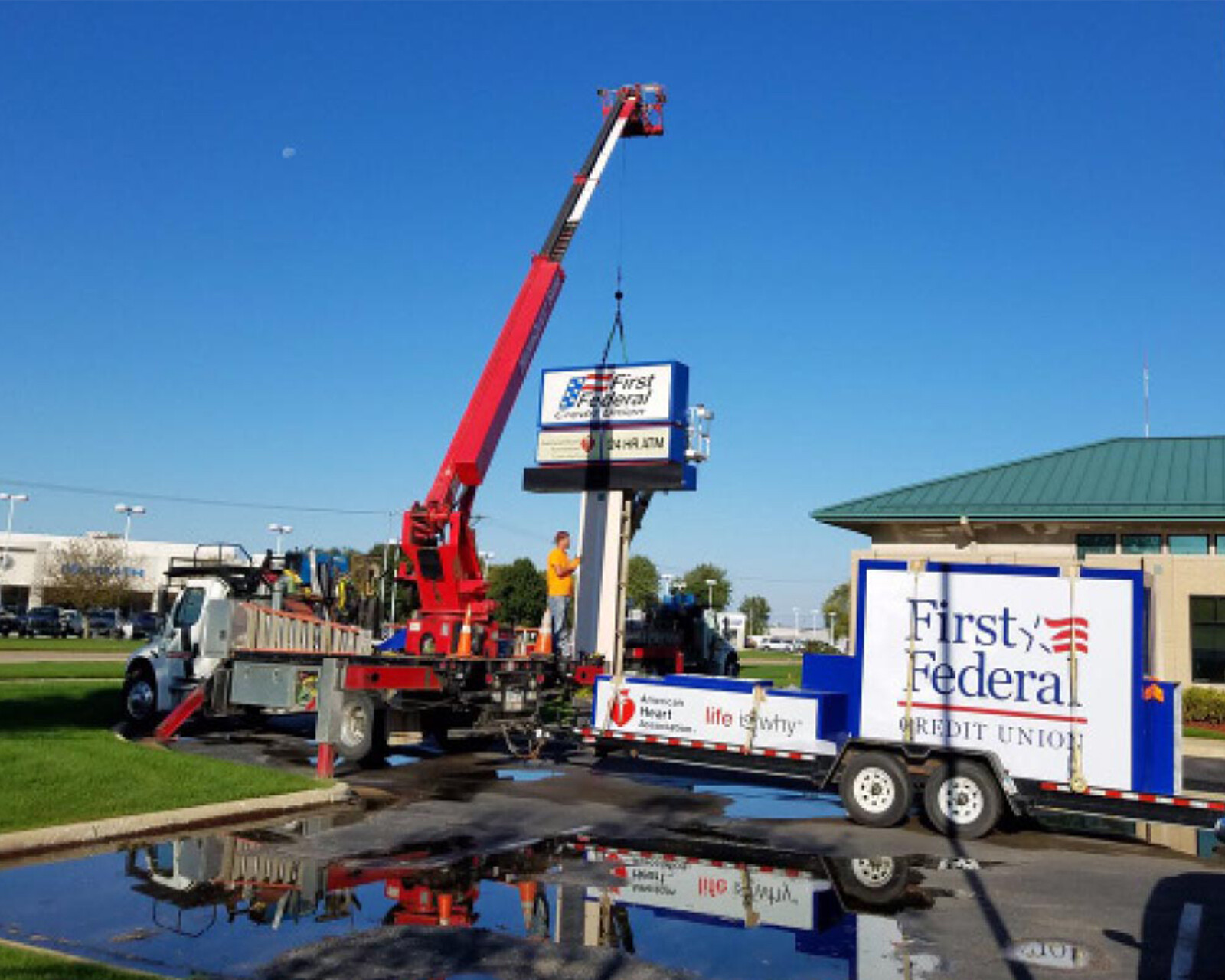
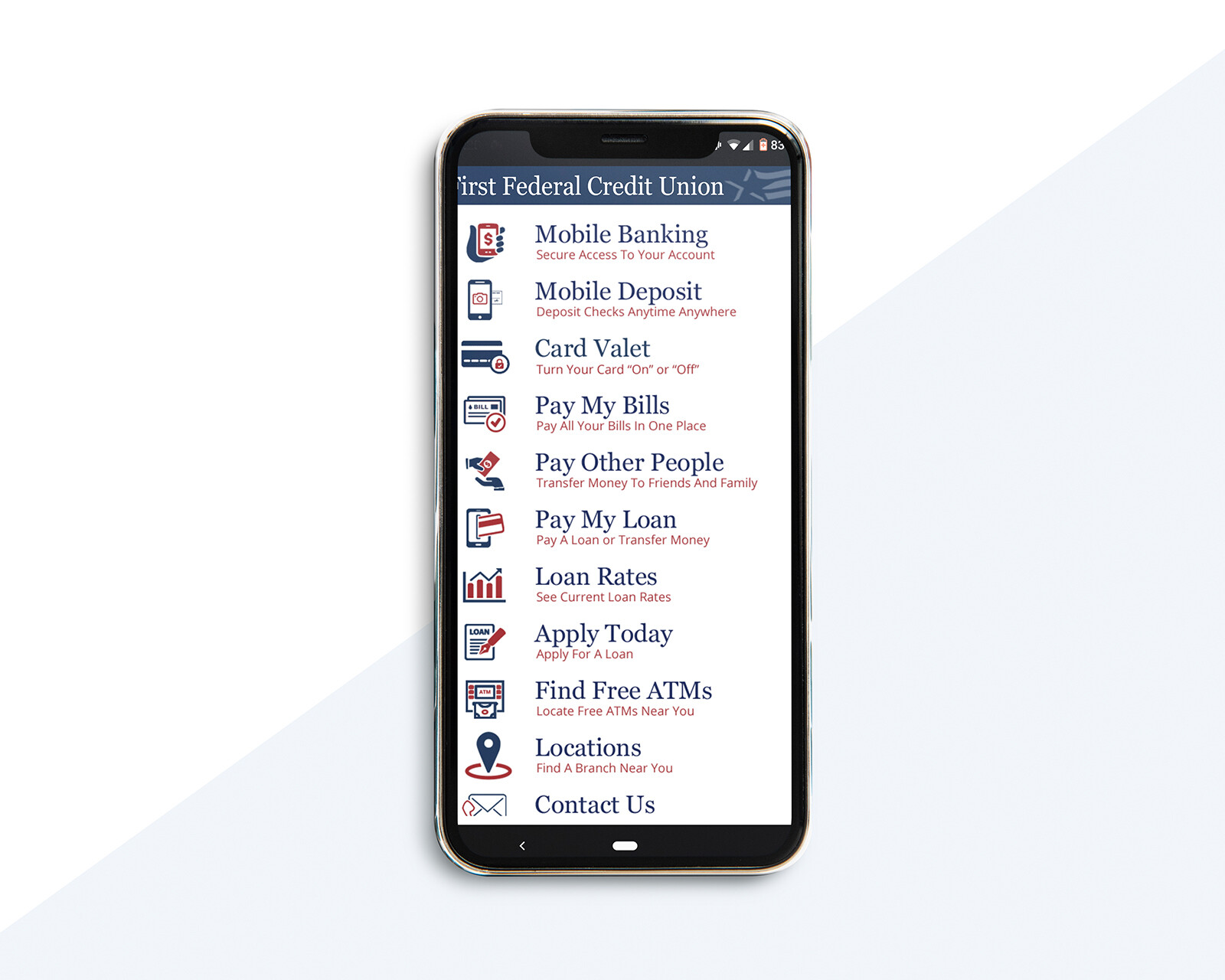
We collaborated with First Federal Credit Union for their company re-brand. It has been set in motion along with new branch locations, new signage, website and a fresh logo and brand guide. It was fun to work on and even more fun to see it come alive.
When going through the rebrand process it is important to maintain consistency. Especially for businesses like First Federal who are established and well-known in the community. We helped with their rebrand as well as kick off their 90th Anniversary campaign in 2017 and have watched them flourish ever since.
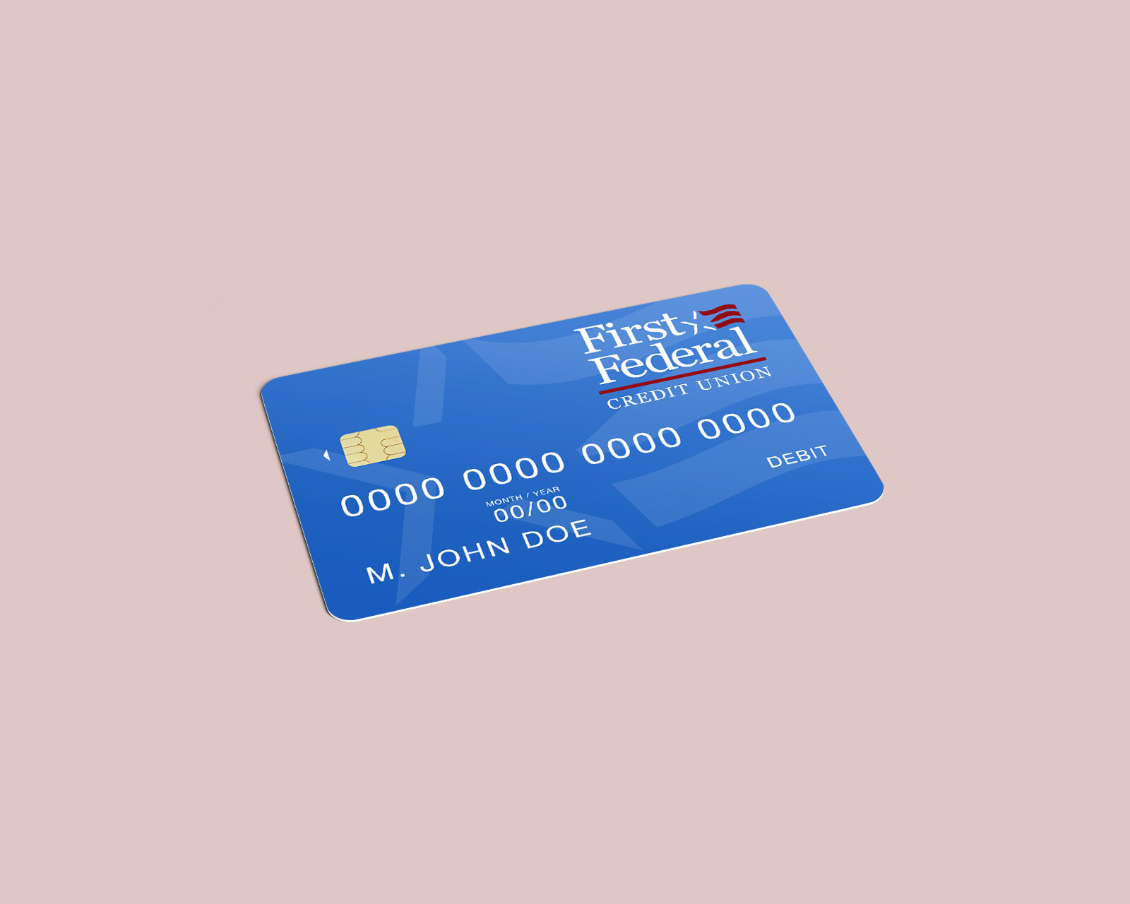
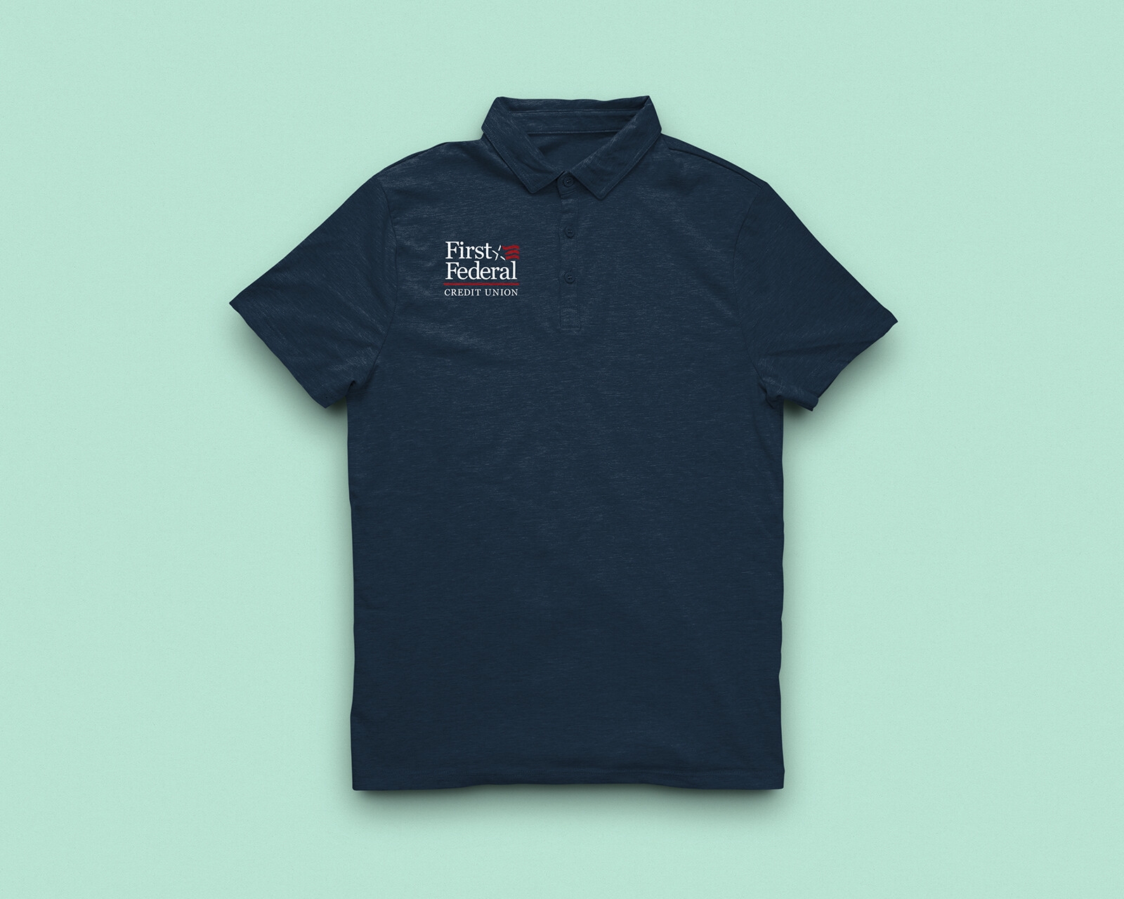
We decided kept a couple of design aspects from the original logo design to transform the business into a brand. First were the brand colors. We altered the colors by using shades of the original brand colors, red, white and blue to give the brand a more professional feel. Secondly, we kept the combination mark and updated it. Georgia creates old world charm with a modern appeal. In Georgia, type design Matthew Carter managed to create a serif typeface that combines legibility with character and charm. The legibility allowed kerning the characters closer together to provide that sense of friendliness and community that is the cornerstone of the FFCU brand. The icon was designed to be standalone as well as compliment the logotype.
Let’s Collaborate
TELL US ABOUT YOUR PROJECT
We love messages and meeting for coffee or tea at one of our favorite local spots. Drop us a note and we’ll get back to you as soon as possible…


