Nourish Med Spa
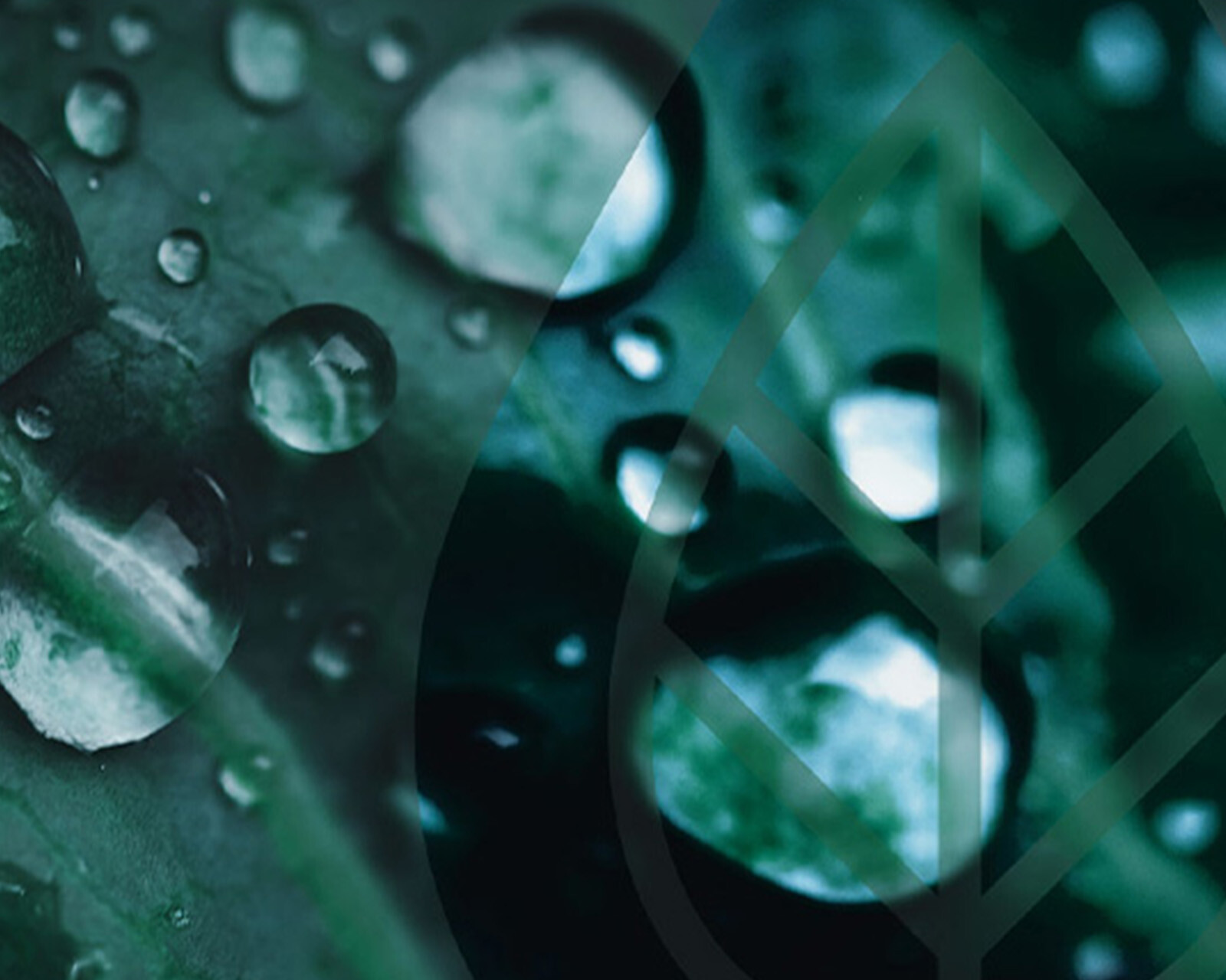
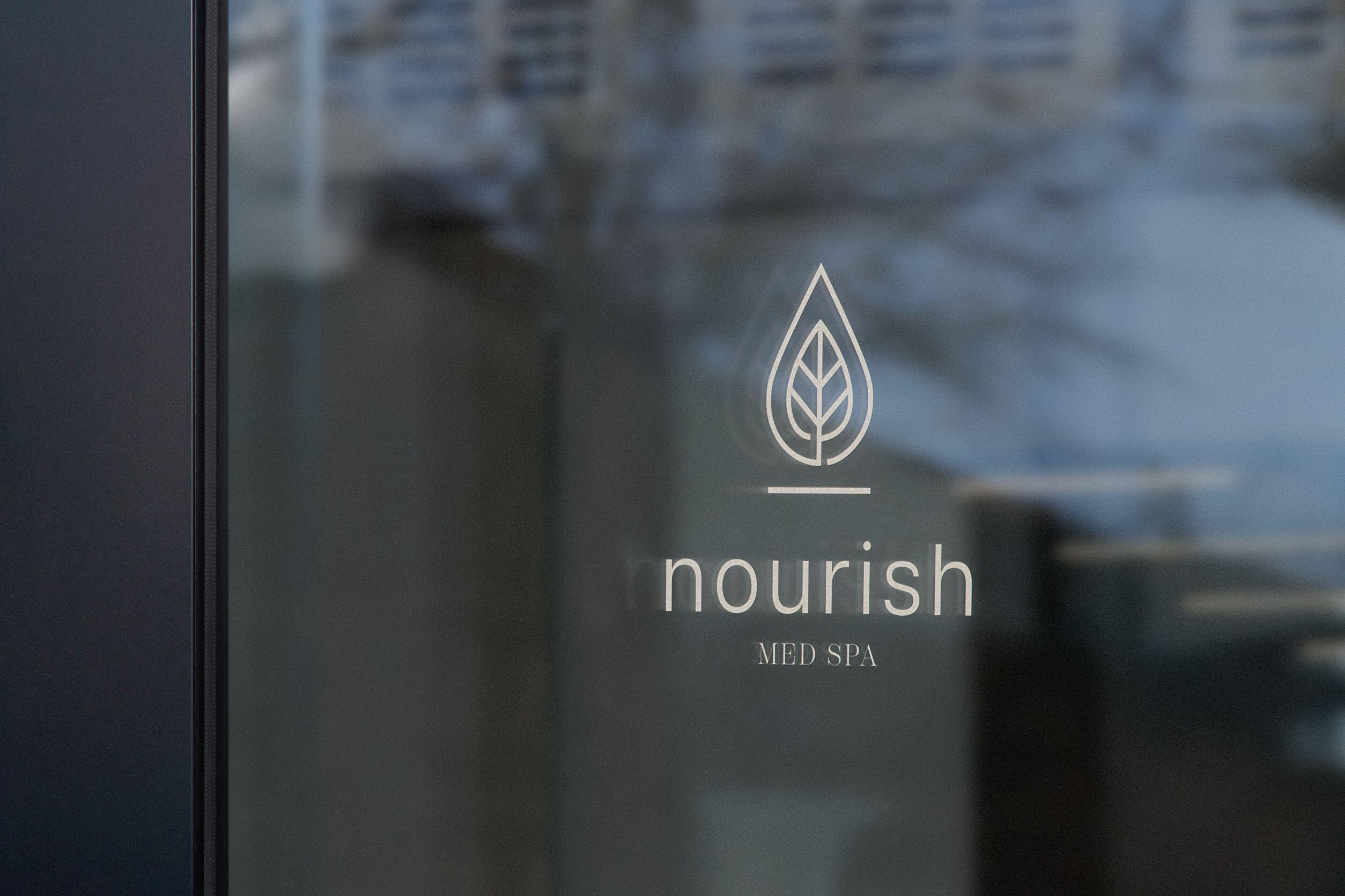
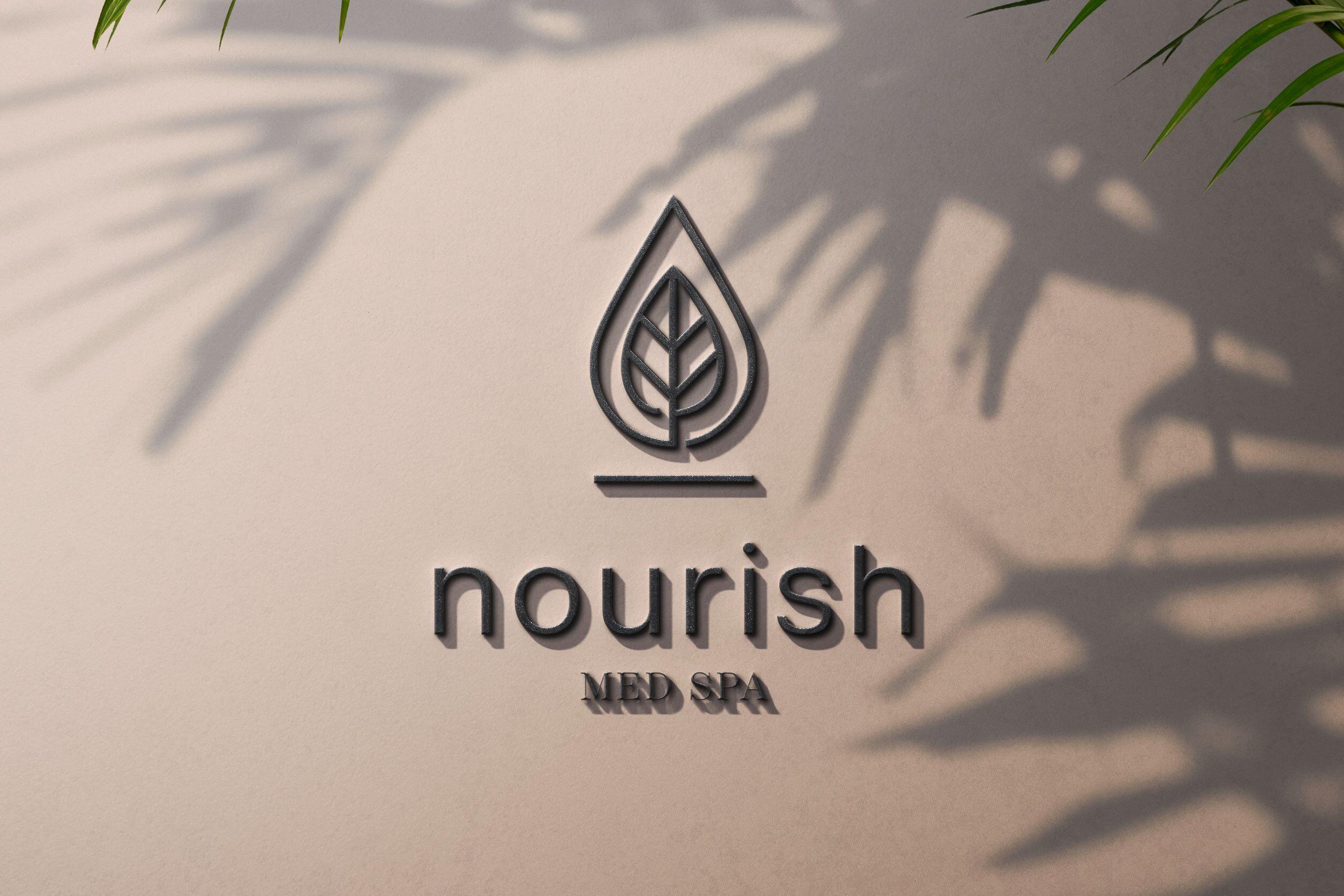
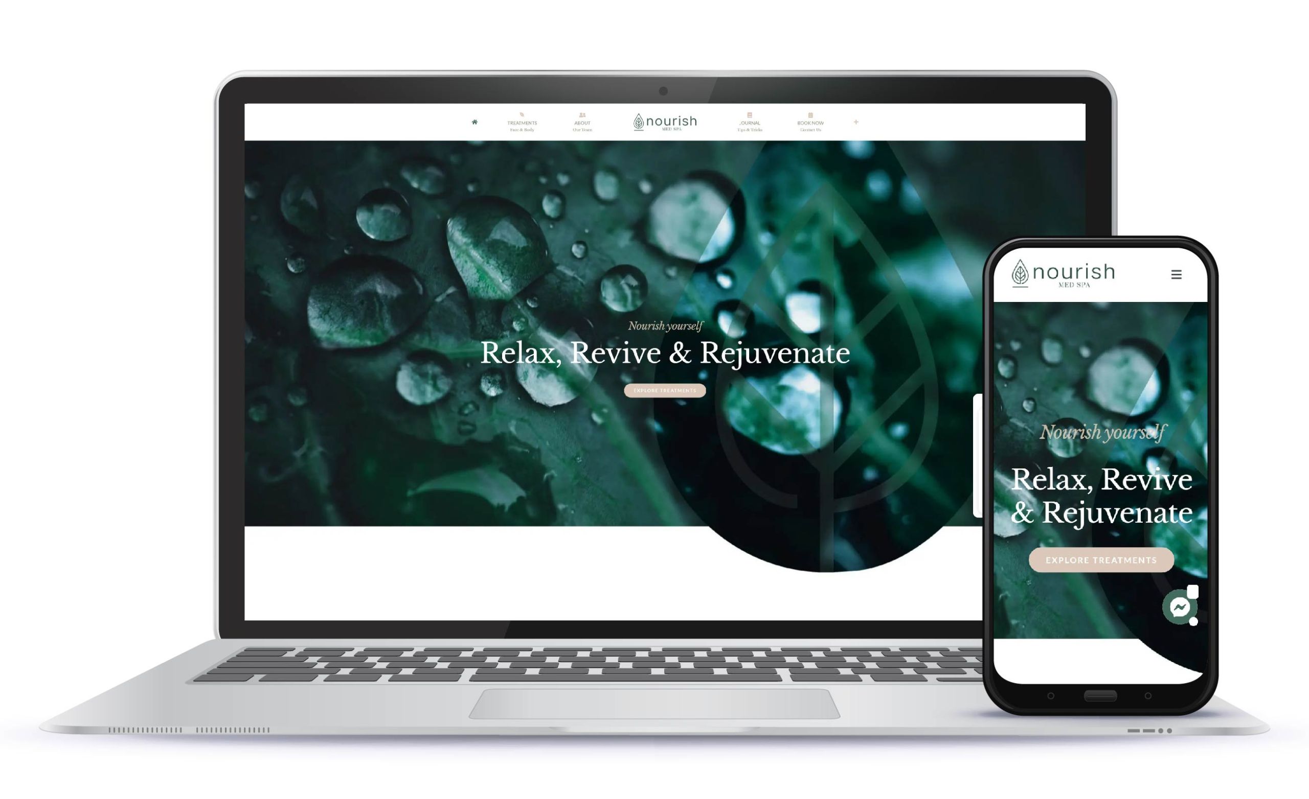
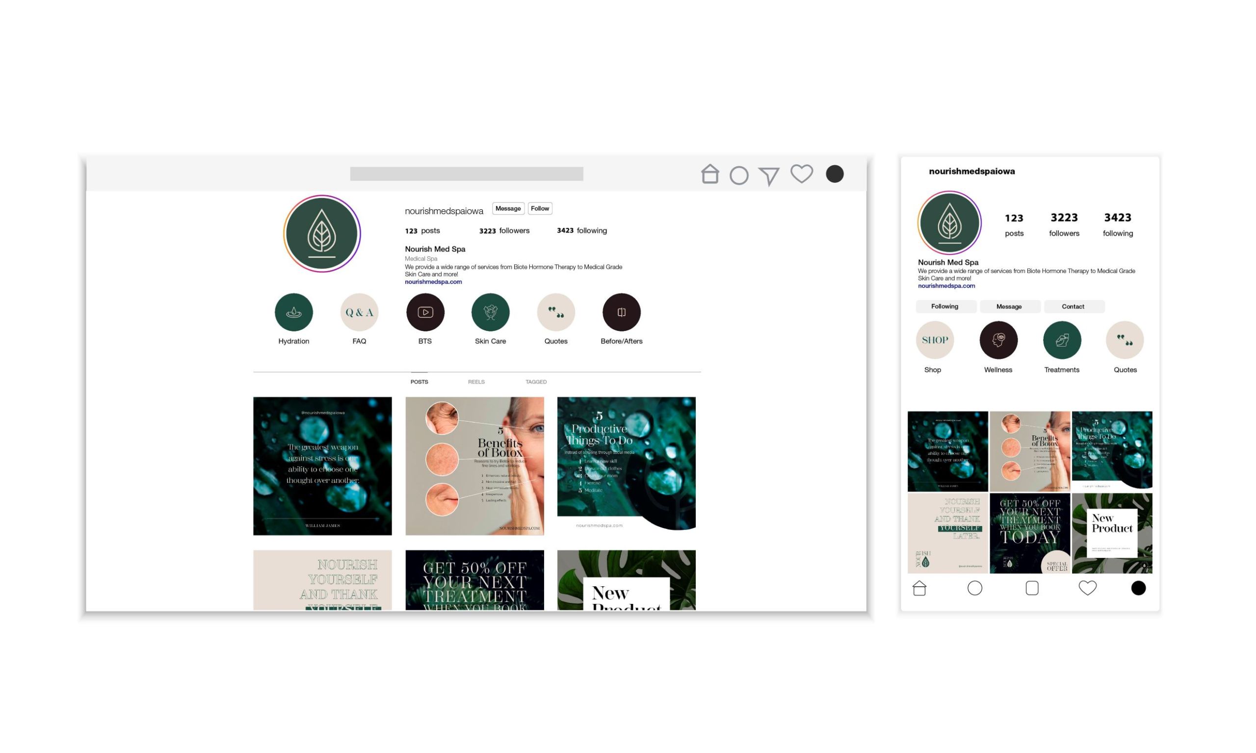
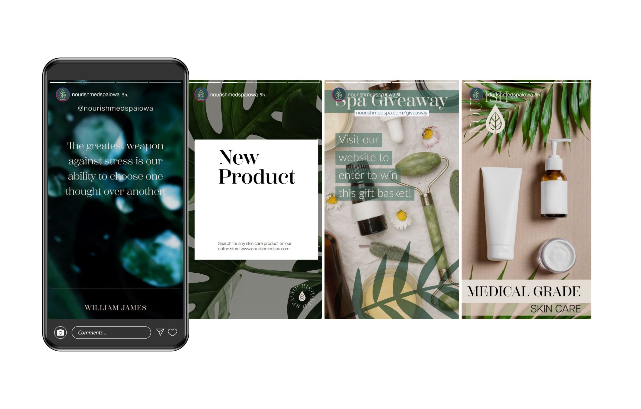
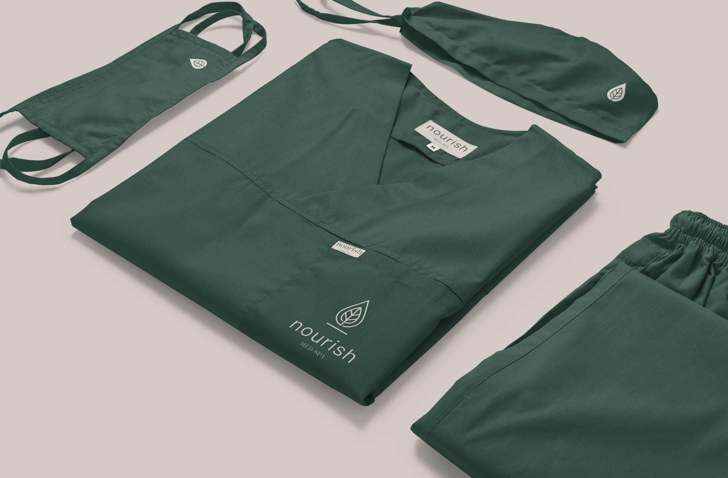
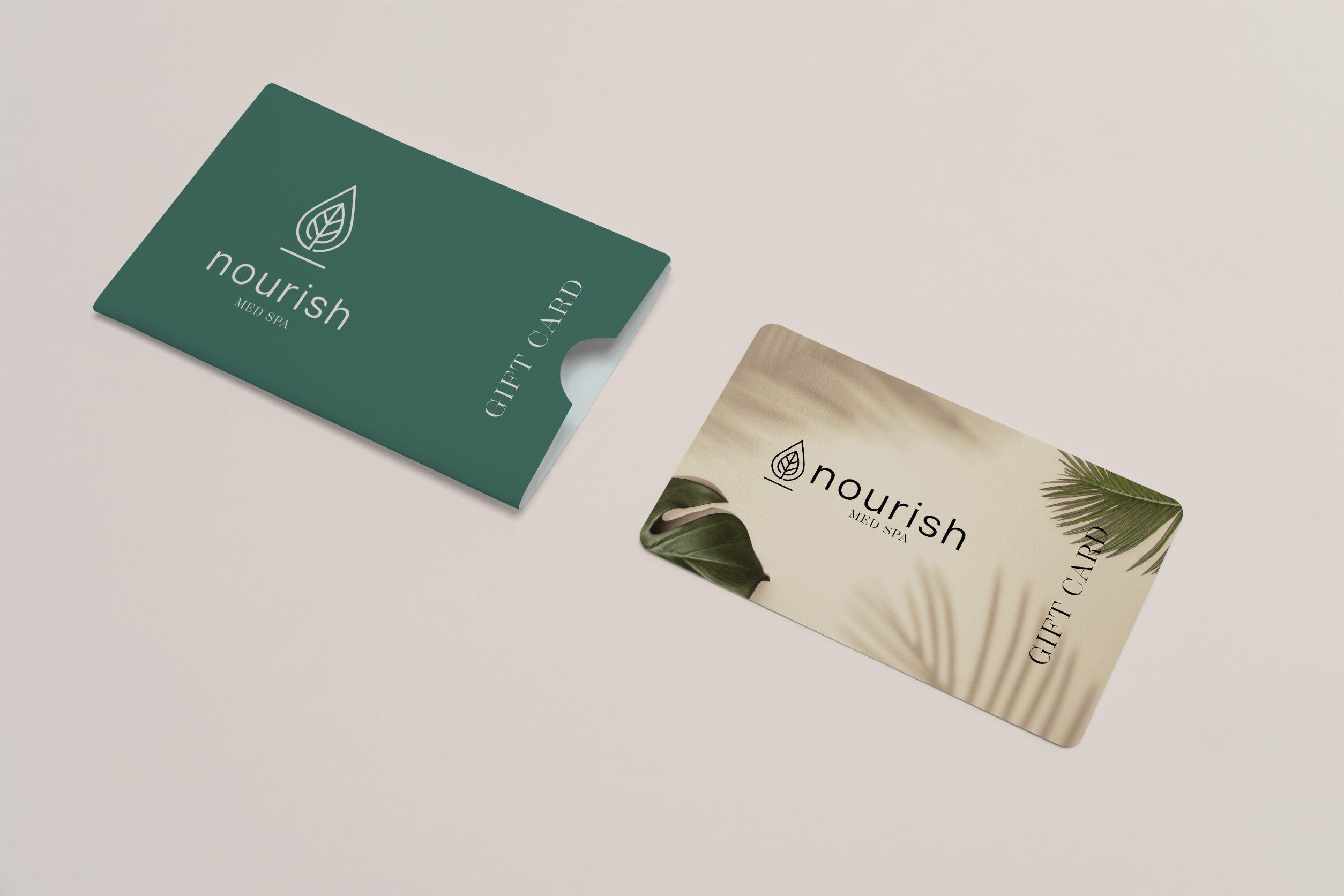
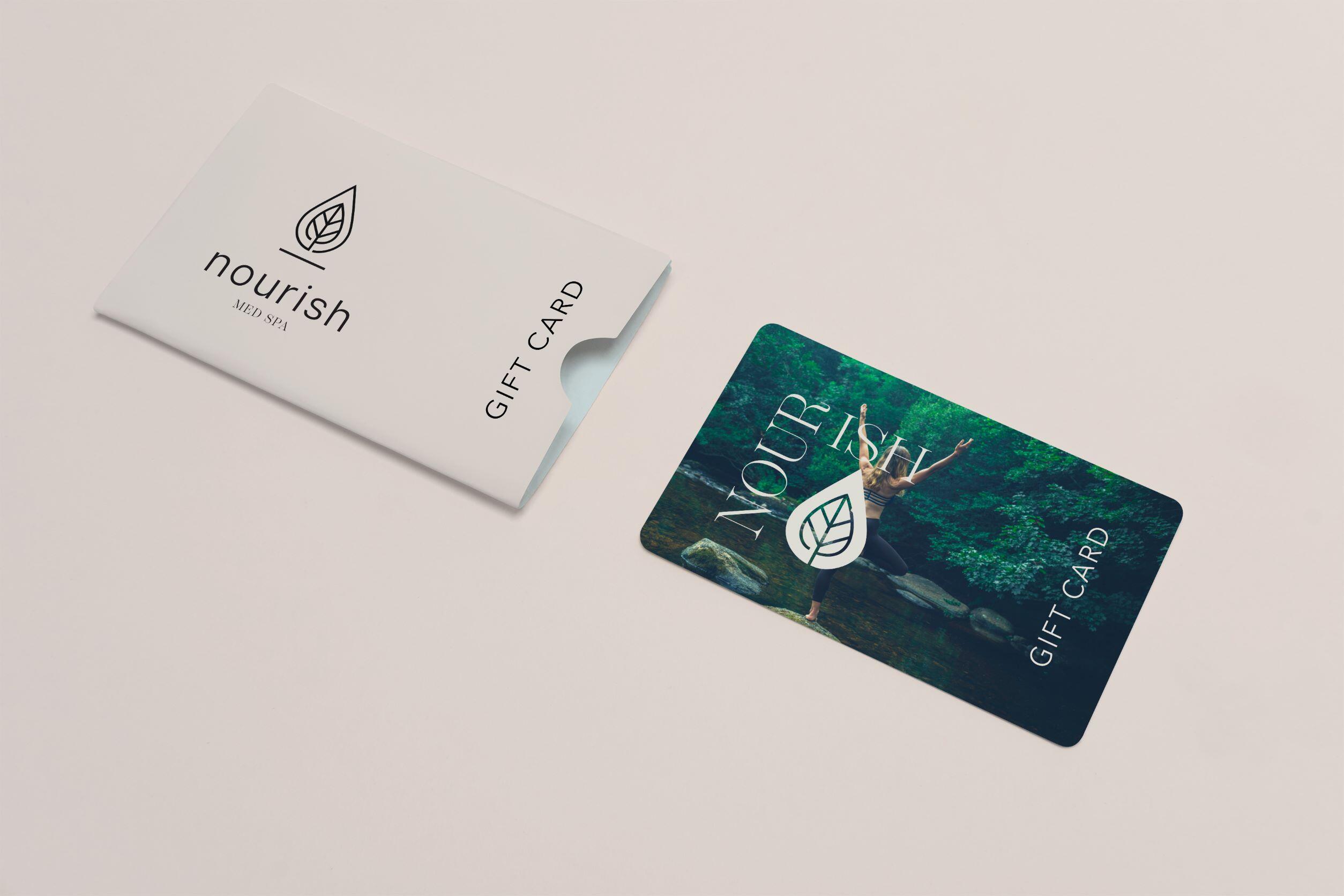
We recently collaborated with Nourish Med Spa to create a comprehensive brand and visual identity. The inspiration for the design is derived from what it means to nourish. Leaves mean many things in different cultures, but the most common symbolism they are used for are related to fertility, hope, abundance, growth and peace. Water is considered the universal symbol for change – it is forever flowing and can take any course. Water is also used to symbolize purity and cleansing.
The logo icon is designed to be modern and geometric to compliment the sans serif typeface. There is an opening in both the water drop and the leaf inside of the water drop also a symbolic welcome to the path/journey to wellness.
Thich Naht Hahn, a Vietnam Buddhist monk, who teaches how to water the seeds of mindfulness said, “When you plant lettuce, if it does not grow well, you don’t blame the lettuce. You look for reasons it is not doing well. It may need fertilizer, or more water, or less sun. You never blame the lettuce.” This metaphor will help to maintain a cohesive brand.
SKILLS NEEDED
Project Management
HTML/CSS Web Design
Development
WordPress
Copy Writing
Visual Design
TECHNICAL
Adobe Illustrator, Dreamweaver, InDesign, Premiere Pro, After Effects, Photoshop and Lightroom
CATEGORIES
Web Design, Graphic Design, Branding, Brand Design
OTHER SERVICES
Photography, Video Production








 Just giving you the heads up: We use cookies and other tracking doodads to make your browsing experience as sweet as a freshly baked batch (Website