Lubben Vineyards & Wines

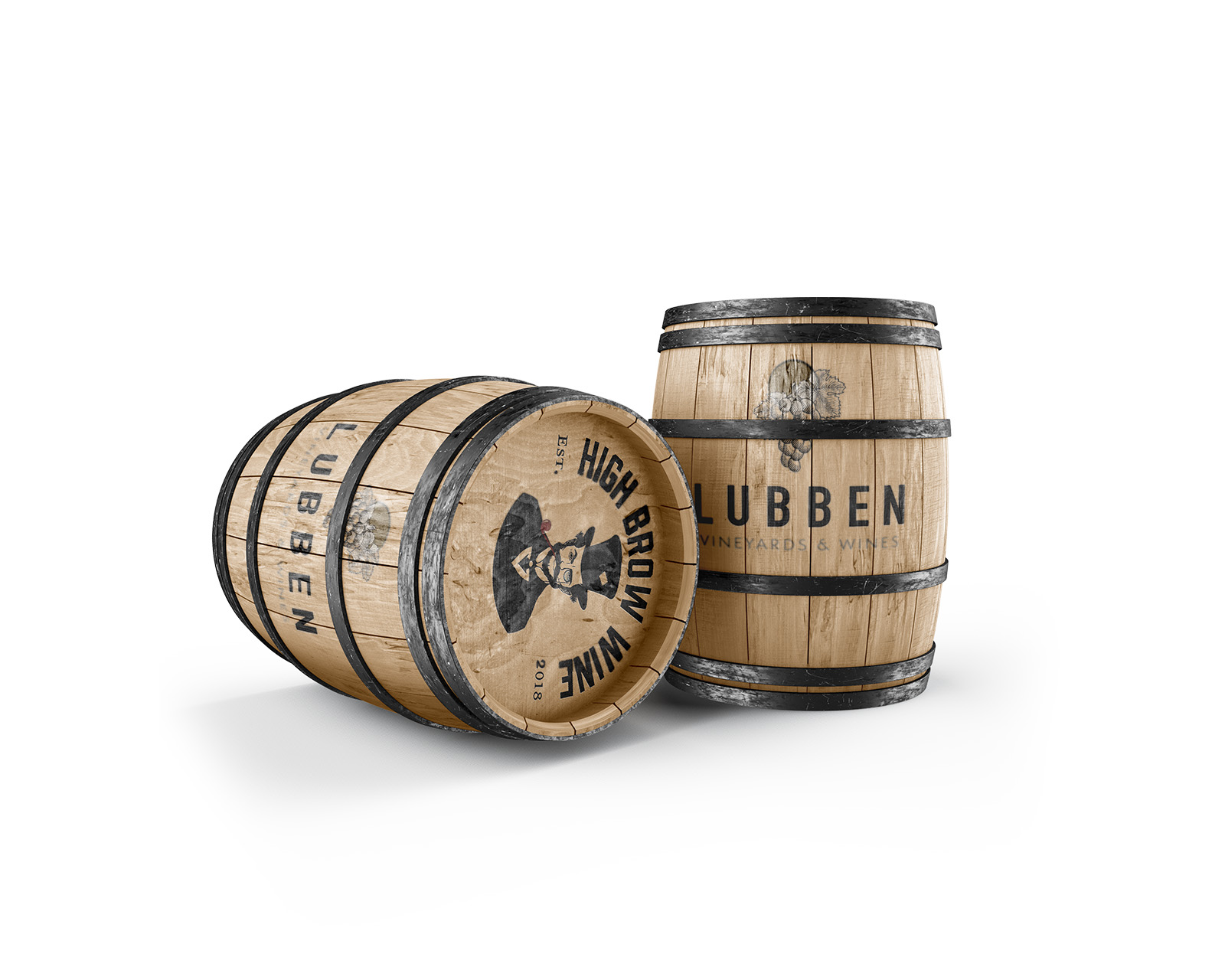
We recently collaborated with Lubben Vineyards to create a comprehensive brand design and visual identity. The brand design inspiration combines vintage advertising and organic design style. Organic design style uses natural and rustic elements that connect well within the natural world. Common elements include natural textures, earthy elements, organic shapes and neutral color palettes. Fluid hand-drawn lines are also a technique in this design style. Organic design often incorporates botanical elements like plants and leaves and is a common design style for eco-friendly brands and growers. Vintage advertising graphic design style encompasses a wide range of visual aesthetics from the early to mid-20th century, characterized by bold typography, persuasive language hand-drawn illustrations, and nostalgic imagery.

The Lubben Vineyards logo is designed to be modern and minimalist. The modern and minimalist design works well for branding the event venue while complimenting the High Brow Wine visual identity.

The High Brow Wine tagline, “Pairs nicely with sarcasm,” is playful, witty and irreverent. The tone encourages consumers to have fun and not take wine too seriously while exuding confidence in its product and expertise. The vintage character emblem captures the brand tone with the distinguished dress hiding ruffled hair while wearing a patched-up hat and a slight smirk on his face.

SKILLS NEEDED

Project Management

Brand Strategy

HTML/CSS Web Design
Development

WordPress

Visual Design

Copy Writing

TECHNICAL

Adobe Illustrator, Dreamweaver, InDesign, Premiere Pro, After Effects, Photoshop and Lightroom

CATEGORIES

Web Design, Graphic Design, Brand Strategy, Brand Design

OTHER SERVICES

Photography, Video Production, Email Marketing

Let’s Collaborate

TELL US ABOUT YOUR PROJECT

We love messages and meeting for coffee or tea at one of our favorite local spots. Drop us a note and we’ll get back to you as soon as possible…

Fill out my online form.